Newish Kid on the Block
What did we do for Block 15?
General Contracting
Interior design
Material Selection
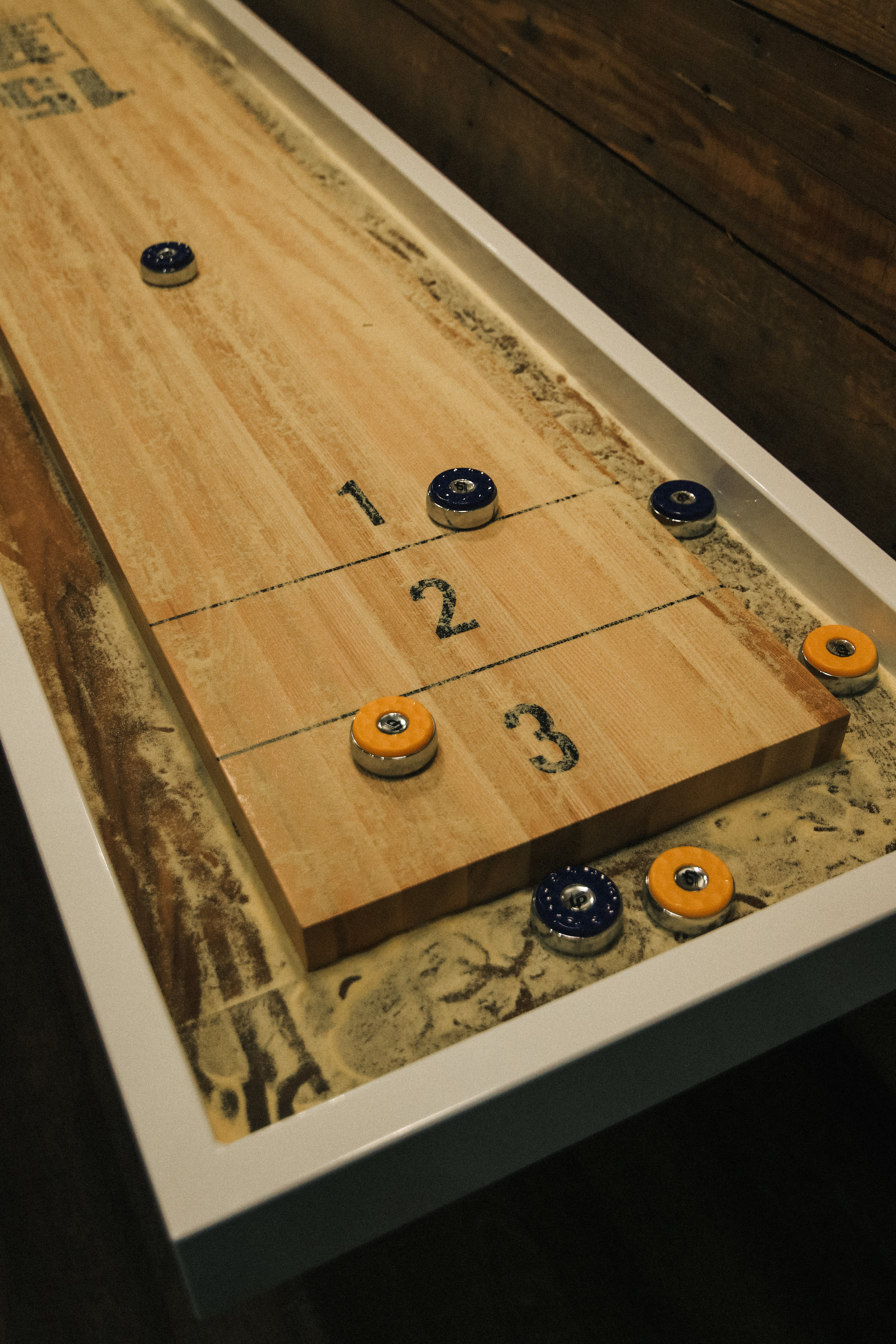
Shuffleboard table
Railings
Bar racks
Bar stools
Benches
Artwork / Murals / Photography
Custom Lighting
Custom Booths
Concrete Sinks
Inspiration for Block 15
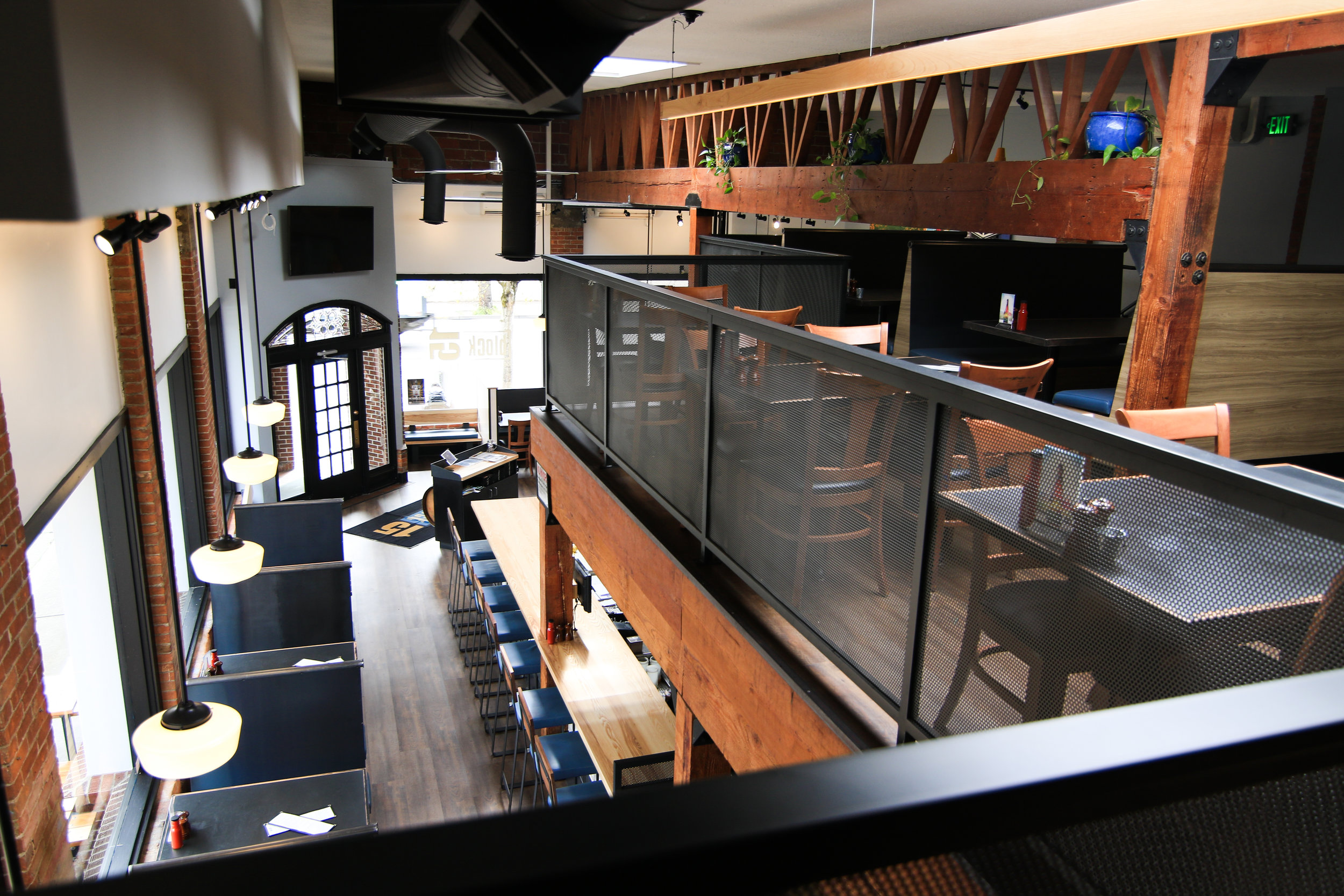
For the Brewery's 10 year anniversary, SHELTER was asked to redesign and update the downtown space, to create a fresh hip new environment for Block 15 and the town of Corvallis. When designing the brewery, we wanted to hold on to some of the main characteristics that had become part of Block 15, as well as to uphold the beauty of the old building by keeping the brick and joists exposed as they have been for years. In selecting materials for the space, we chose finishes that would withstand an extreme amount of use, and that also tied into the existing brand colors and elements used in all of there locations; Caves and the Southtown location. Our goal was to increase the cleanliness, durability and comfort throughout the space. We strived to create a more mature and cohesive look, so that wherever you were in the brewery, you would have the same experience. As a trademark of SHELTER, we must always include bold wall statements and contrasting "pops" of color, to create that vibrant yet warm environment.
Favorite Element of Block 15
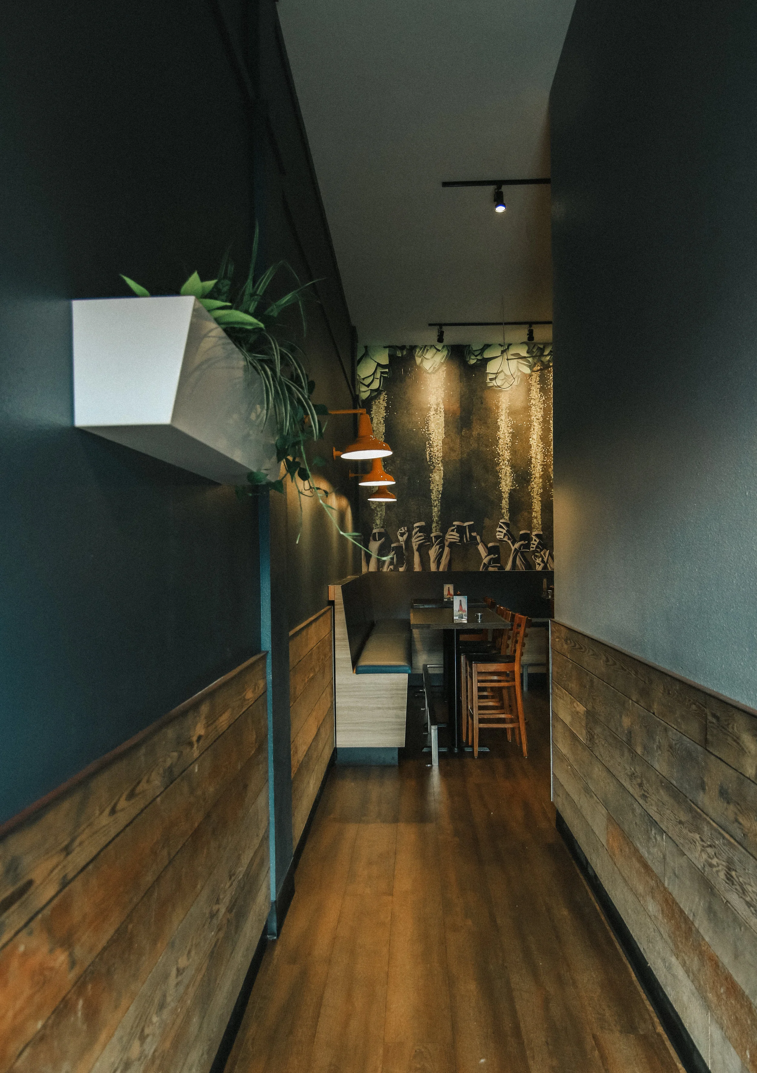
The tap list was one of our favorite elements of Block 15. We were able to create a clean, sleek, custom design that is easy to swap out for a constantly rotating tap list. Another one of our favorite pieces would have to be the bar stools that feature bent steel, walnut backs and an extra thick upholstered cushion that is “comfy as f*&$” as requested by the owner. We also really enjoy the transformation that the back game room has undergone. Instead of feeling like a disconnected space from the main restaurant, it now carries the same, clean, fresh look while remaining very warm and fun with the addition of the wall mounted barn lights, oversized wall mural, and a fully customized shuffleboard table built to keep parties busy for years to come.
Some things to look out for
Throughout the brewery there are many small detail elements that really give the space a nice touch both visually and efficiently. The main host station when you first walk in displays the "15" name proud, yet does so in a mature stance, sophisticated and edgy. It also incorporated one of the original barrels that have stood there since day one. The front booths along the north window wall have cleverly integrated coat hooks, making it an ease when you need them, yet they visually disappear when you don't. Another great change is all the walls we took down. Its hard to notice if you hadn't been in the space before, however the original wall placements in several locations really sectioned off the restaurant. Now the space feels open and free and really makes one want to wander around the brewery.
Favorite Beer from Block 15
Sticky Hands IPA
Favorite Menu Item
Garlic Parmesan Fries.
On another note...
The owner really likes Hot Pink.
To view more photos, visit the Block 15 build-out page.
To see before and demo photos of the space click here.


