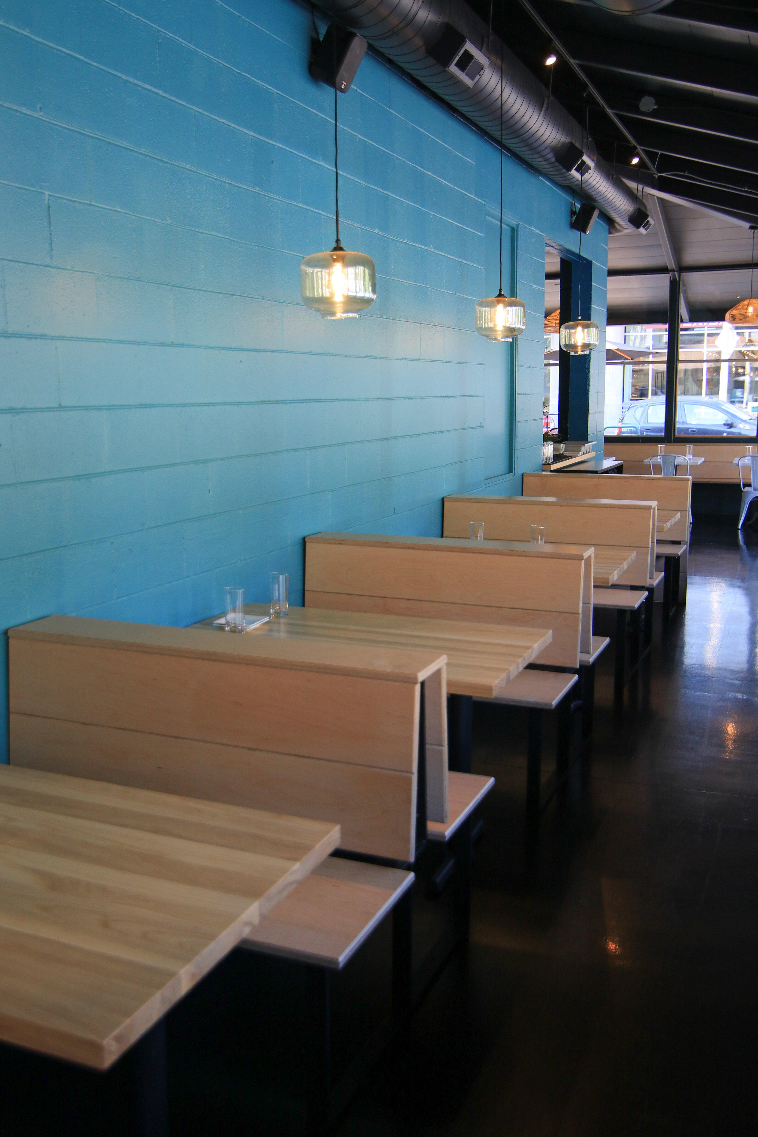
Anchoi - The Build-out
What did we do for Anchoi?
Full interior design
Material Selection
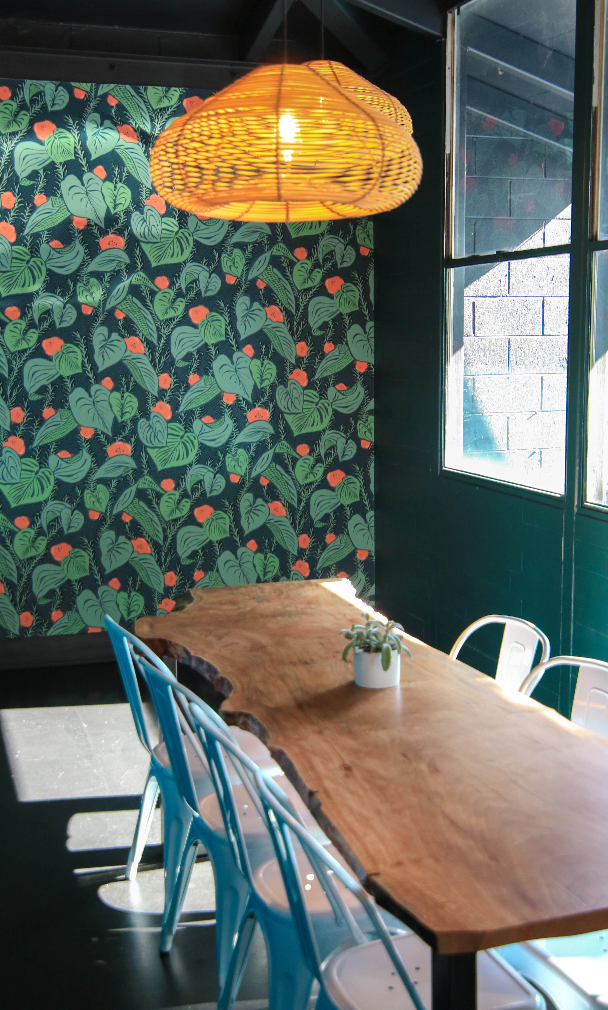
Live edge tables
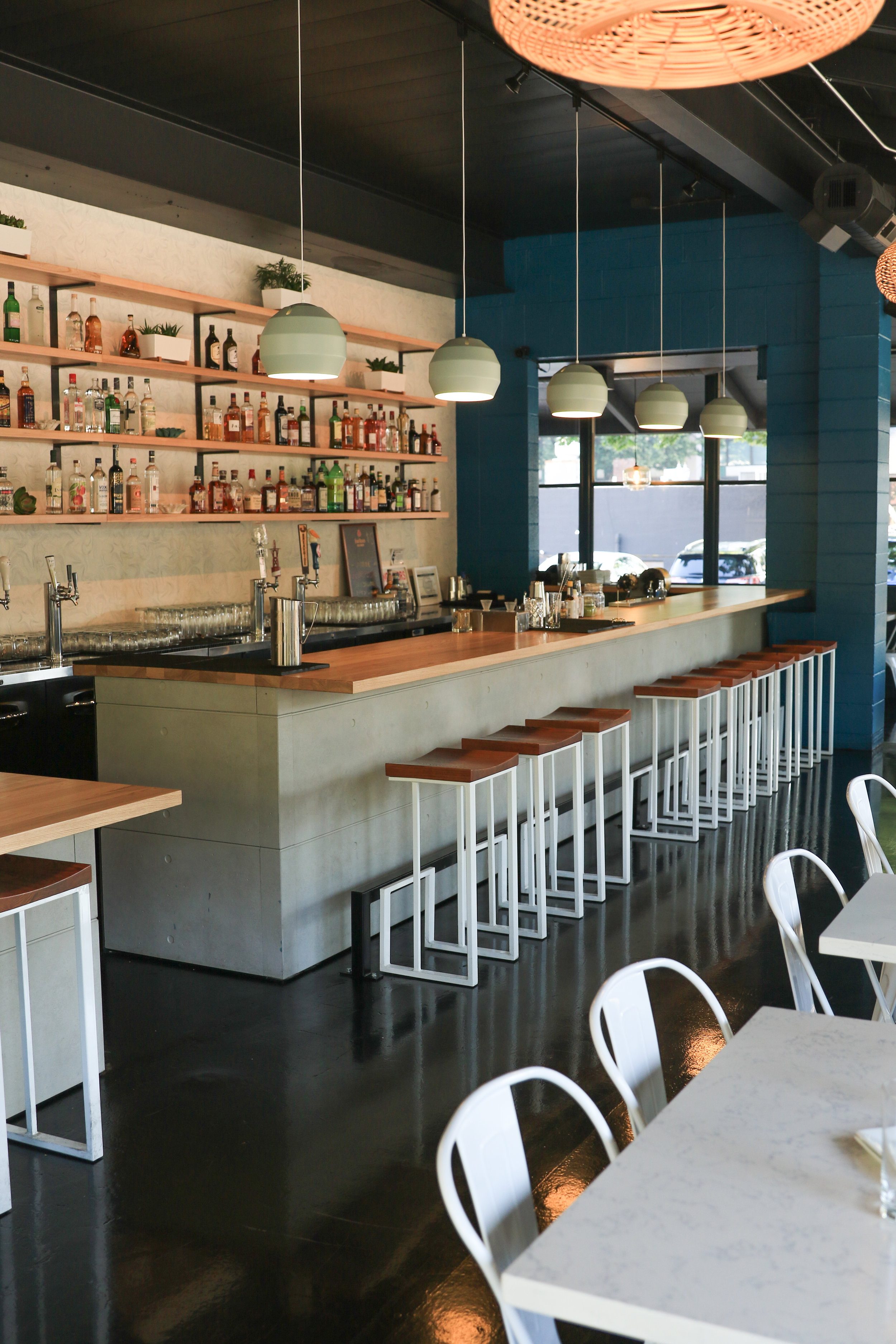
Bar shelving
Booth seating
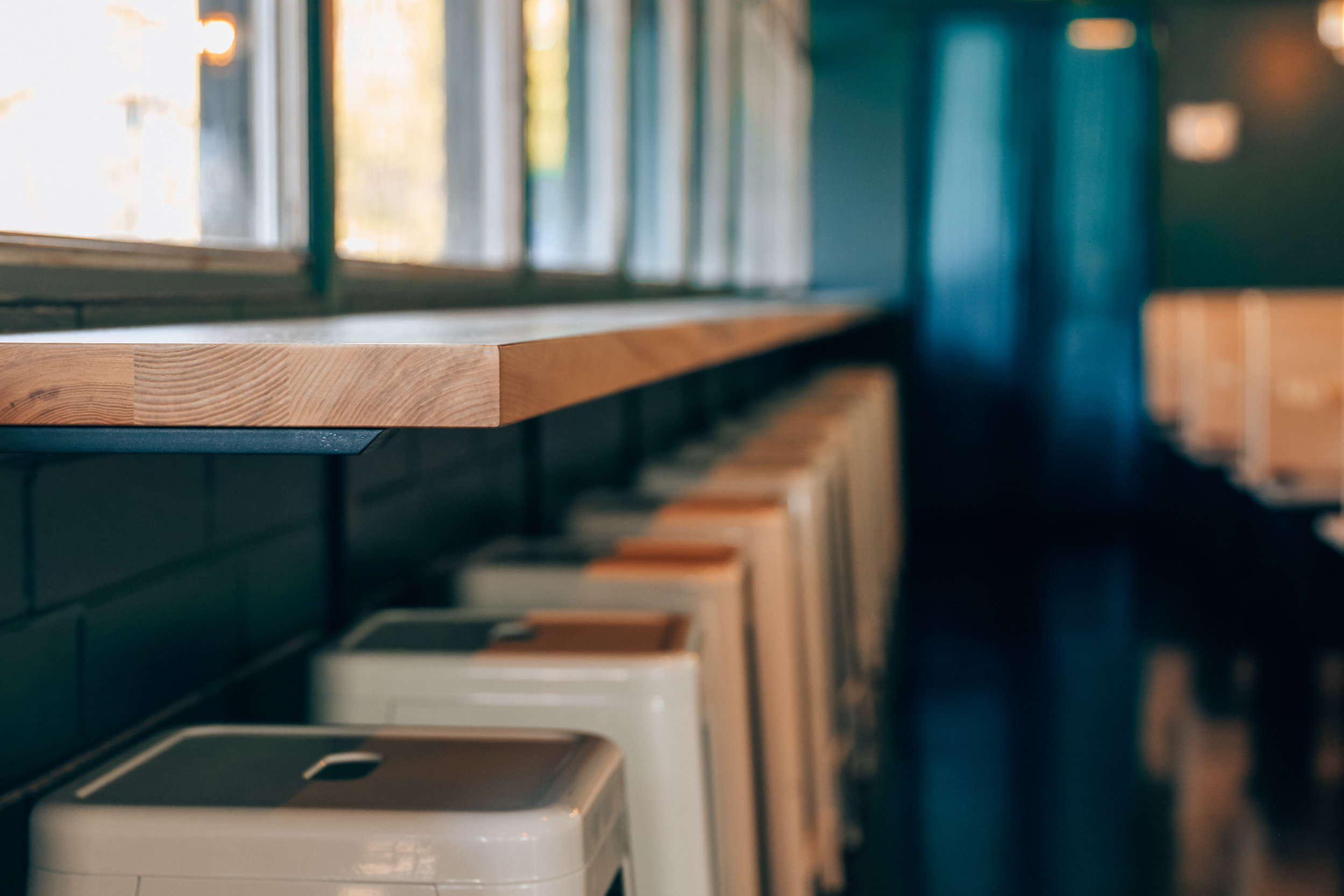
Bar tops
Branding
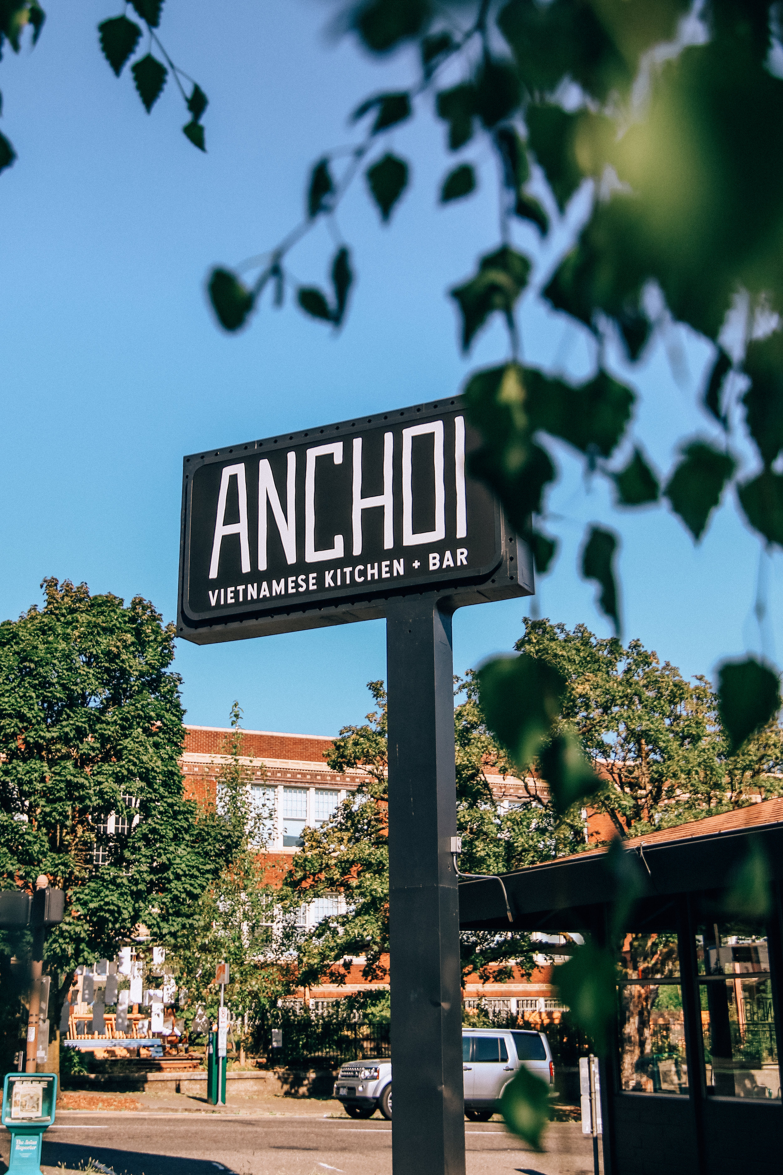
Signage
Inspiration for Anchoi
Our inspiration for Anchoi stemmed from Owner, Therese Tran's desire to have a contemporary space that felt clean yet inviting. We started off with a very simple color palette of white, grey's and black but wanted to add in some pops of color that would give the space a more welcoming feel to it's customers and employees. With that in mind we introduced several hues of turquoise blue's that you can see throughout the walls in the space.
Favorite Element of Anchoi
The live edge tables have to be our favorite element of Anchoi, they give character and warmth to the space and can be used for big parties or private events. In addition, they are a good contrast to the white marble tables in the space.
Another one of our favorite elements is the main bar facade. Cement board paneling helps resemble a poured concrete wall look which ties into the restaurants theme. This material was a new product for us and we feel it incorporated well within the clean and contemporary space.
Last but certainly not least, the wallpaper. This was a fun addition to the restaurant that added texture and color. We were able to use a local Portland wallpaper company, Make Like for the designs. It's always so fulfilling to be able to find awesome local companies that are making rad designs that we can incorporate into the environments we create.
Favorite Menu Item
Vermicelli Noodle Bowl with Crispy Spring Rolls.


